Tuesday, 3 April 2012

Copyright Issues

Where can you get images and fonts?

You can source stock images from the following web libraries:

istockphoto
Getty Images
Dreamstime
OzImages
Shutterstock
Foto Search
aapone

The above websites offer thousands of photos, illustrations, audio and video files, flash and vector images that can be used for personal use or graphic design purposes, they come with a set of terms and conditions and different licencing for different purposes. 


You can source font from the following font foundries: 
Linotype
Emigre
FontFont
The Font Bureau
ITC Fonts

They offer a range of fonts, and font families that can be bought for the use of graphic design purposes, advertising purposes, and personal use. They also come with a set of terms and conditions, and licensing for different purposes.

How can you get these images and fonts? Terms and Conditions included.

IMAGES
I chose three different stock images, from three different websites - to show the differences in prices, licencing and how you go about acquiring these images from different photo libraries. 


1. iStockphoto 
This image to the left could potentially be used in the future to place the team logo on the side of the bus, simulating what a team bus would look like once the logo is finalised and produced.


iStockphoto works with a pay-as-you-go credit system. There's are two categories in which you can buy these credits, and the amount that your buying relates to them. 
These include; "Small One Off Projects" and "Large or Ongoing Projects. 


The price of credits ranges, the smallest amount that can be bought is 6 credits, which costs $11.00, works out to be $1.81 per credit. The largest amount is 1000 credits, for $1531.50, which works out to be $1.51 per credit. If that's not enough, larger amounts are available but they are considerably dearer.


The costs of these files is dependant on the size of the image, and the type of image. For example, an extra small basic photo, would cost 1 credit. Where as a extra small basic illustration would cost 3. 


Licences are also available, which have there own set of conditions and regulations for how many times the product can be reused and how long you have ownership of the product.


2. Getty Images
This image could be used to display the logo on a uniform. 


Getty Images has a specific price for each image, in different sizes and resolutions, its more of an online shop that iStockphoto and images can be added to a cart and then purchased all at once. 


The price increases with the size and resolution of the images, and they are all in RGB mode. All images can be used for commercial use. 


All the rights to the images stay with Getty Images, but they are licenced to be used by customers, but can not be used in any reproduced materials within, out outside of the company/person who has bought the image. 


3. Shutterstock 
This image could be used to display the team logo on a piece of equipment.


Shutterstock has two types of licences available to customers. The standard license, which allows the image purchased to be used for most commercial uses and some merchandising uses. And the enhanced license, which allows unlimited merchandising uses as well as commerical uses.


When using Shutterstock you can either buy your images individually or buy a bundle deal, where you have a year to make as many purchases as stated in the deal, and you have a year to make these purchases.


All three of these websites offer downloads to their images, that can be payed by credit card or paypal. They also have search engines built into the website with keywords to their images, which makes finding exactly what your looking for a lot easier. 


FONTS 

When looking for typefaces that suit a certain project, or a typeface you may have seen, liked, and then photographed. Websites such as IdentiFont and What The Font, help you in finding them.


Font foundry's offer all different types of fonts that are available for purchase with licencing to state how many times, and for what, these fonts can be used. 
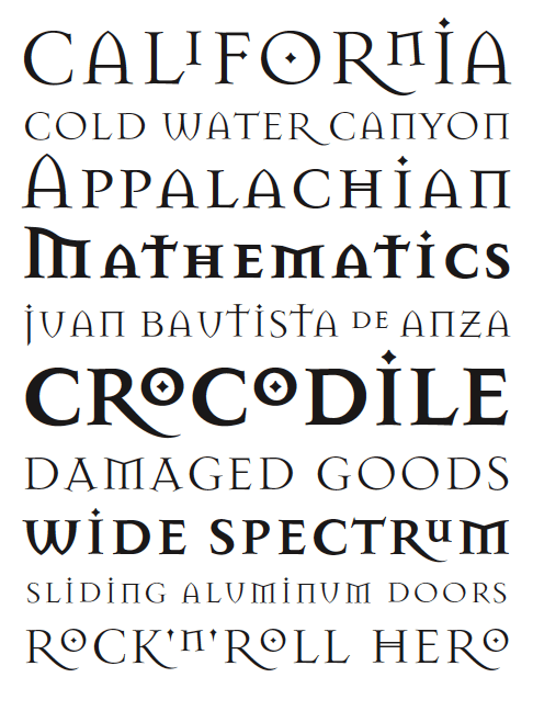
Emigre, lists the different styles and type designers - so you can search for the typeface your looking for. 


The font shown above is called "Mason" and was described as a Greek styled font. This could potentially be used in the logo. To buy this particular font would cost $125 dollars and included in that family is Mason Serif Regular, and Mason Serif Bold. The website also offers the design features of the specific type face.


It works the same as a stock image library, in the way that the fonts are downloadable and you pay by either pay pal or credit card. By downloading these fonts, you are binding yourself to a legal agreement, as mentioned in the terms and conditions.


The way the licencing works (for Emigre in particular, other font foundry's would have there own guidelines with similarities to this one) is that a basic licence covers you to have 1 location for the font (for example a design studio) with up to five devices in that location that are able to use it (for example, a mac computer). The fonts can not be modified or changed in any way shape or form, embedding the fonts into digital images will incur another charge, and Emigre must be mentioned in the production credits. 


Bibliography
http://www.emigre.com/EULOptions.php
http://www.shutterstock.com/licensing.mhtml
http://www.istockphoto.com/help/licenses
http://www.gettyimages.com.au/Corporate/LicenseInfo.aspx

Monday, 12 March 2012

Culture in Design


The Best of Both Worlds: A Forum In Delhi about International Collaborations in Craft & Design
by Kevin Murray


This is the first public event in India of a project that may be of interest to Indigo members. It would be great to see you there. Please see website for more details.

Trent Jansen 'Sign stool' from reused road signs (limited edition)

‘The Best of Both Worlds’ considers the increasing number of transnational partnerships being forged between craft and design. How can we combine the free-wheeling possibilities of modern capitalist world with the grounded meaning of cultural traditions?

Typically, a designer from a wealthy Western country seeks to produce something handmade using skills of a traditional artisan. While this does seem to reinforce global inequalities, it is often the best alternative for those seeking to sustain their craft. So how can designers and artisans work together in product development as a fair partnership? How can designers work with artisans in a way that respects their unique contribution? What is the role for Indian designers in these new transnational supply chains?

This forum is part of Sangam: The Australia India Design Platform, which is a three year program of events designed to promote creative design partnerships between Australia and India. It includes roundtables, forums and workshops in Melbourne and Delhi, Sydney and Ahmedabad, and Brisbane and Bangalore. To support partnerships, a code of practice for creative collaborations is being developed.

Come join in a public forum to consider the opportunities for craft and design through international partnerships. Hear from leading innovative designers and craftspersons in Australia and India, including Trent Jansen, Ishan Khosla, Matthew Butler and Sandra Bowkett. Consider the role of ethical consumerism in generating opportunities in craft, fashion, design and social justice.

Sangam (‘confluence’) is a strategic initiative of the Visual Arts Board (Australia Council) and supported by the Australia India Institute. It is located in the Ethical Design Laboratory, a research area of RMIT Centre for Design. Visit www.sangamproject.net for more information and register for updates.


My Response 

I think this is fantastic idea, and beneficial for all involved. There's no better way to strengthen your cultural awareness than by experiencing it, art is a great way to document those experiences, and bring two worlds together.

In western culture, more and more so we seem to stray away from traditional media, and creating traditional arts. So it would be very interesting to see someone go back in time with there art work, how their own personal styles would shine through these ancient, traditional techniques and the beautiful collaborations that would be created.

Aboriginal Motifs

– Aboriginal Motifs –

The Visual Arts & Protocol Guide, gives a list of 12 different principles, with protocols that need to be followed to incorporate aboriginal heritage in your artwork.
Two of those being respect and attribution & copyright.

Respect 
When coming up with any designs that are linked to, or reference aboriginal culture and heritage you have to keep in mind that Indigenous Australians, Aboriginals and Torres Strait Islanders, are the original inhabitants of Australia, and you must respect that. 
When creating artwork, the land must be acknowledged. So for example if you were designing a football logo, or an aboriginal community based football team, you would have to acknowledge who owned the land that their home ground was on, and incorporate that into your design. 
You would also seek approval from someone in the indigenous community, related to public art based projects. 

Attribution & Copyright 
Although there is no law, it is highly recommended that when using a piece of information, whether it be a an indigenous saying or motif, that the language group relevant should be acknowledged and mentioned as a part of the design.
Also attributing the source of which you gained a certain cultural image, in each and every publication that the artwork is used in. 


– Moral Rights & Issues –

Some moral rights and issues to be aware of when creating these designs, as stipulated in the protocol guide, are as follows.
• Attribute the artist - the original artists can ask for their names to be clearly displayed on all artworks that are in reference to it, and any reproductions of that artwork.
• No false or misleading attribution - Original artists have the right to take action if their work has been attributed to the wrong person
• Treating the artwork properly - Ways in which the use of artwork can be mistreated is by distorting, destructing or mutilating the artwork itself, or in such a way that it causes harm to the reputation of the original artist.
• Exhibiting the work in a certain way, or certain place that would cause harm to the original artists reputation. 

Native American Motifs

Atlanta Braves - American Baseball Team
sourced from http://content.sportslogos.net/logos/

The Atlanta braves have had a various amount of logo changes throughout the years, but to the right is the most current logo, that's displayed on their official website. 
To see a gallery of their past logos click here!

– Critical Description – 
Compared to other logos that have come before this one, its not awfully strong and sticking with a previous one would overall been more effective in my opinion.


The cursive type that has been chosen, is a motif in itself as typefaces with many similarities are used for other basketball teams logos; Milwaukee Brewers, Bay Bears, The Yankees, Orials, Cardinals, etc. The list goes on, it has a very distinct look that is often referred straight to baseball.


The teams colours have never changed, but the way chosen in displaying them has. In previous years the type has been reversed out to white, with a navy blue outline, and a red background. I feel this is more visually pleasing than the red text, with the navy outline. The contrast is quite strong, and even hurts your eyes a little bit.
The original logo featured an illustration of an Indian Head, named Chief Noc-A-Homa, to reference the Native American theme behind the name "Atlanta Braves", it also featured a tomahawk - which is an axe used by Native Americans. This logo was sought to be too controversial, so the Chief Noc-A-Homa was removed, but the Tomahawk still remains. 


I think the original illustration was much more visually interesting than just the tomahawk and the name of the league, but I can definitely see how it was offensive and it had to be removed. Personally if I were to make any changes to this current logo it would be to the composition and the way the colours have been displayed. For example if the text was on less of a slant, and the tomahawk underlined the word "Braves".


Bibliography
http://sportslogos.net/search_results.php?q=atlanta%20braves&p=1
http://www.logoreviews.org/atlanta-braves-logo
http://en.wikipedia.org/wiki/Tomahawk


Tuesday, 6 March 2012

Clash of The Titans


1) Who are the Titans?
The Titans comprised of twelve gods, who were dethroned by the Olympians. 


2) Are the any interesting motifs you see frequently appearing (Eg. Lightning bolts)? How do you interpret their meaning? Can you name a modern version, of this motif, used today?

a) Lightening bolts - Used in sporting logos such as "Port Power"
b) Bowl Shaped Candles - Displayed throughout the movie in the heavens, they had bowl's that held candles. These are still used today in modern interior decoration.
c) Shields - Used frequently in the movie, its still used in the modern day culture in Videogames - Such as Zelda. 
d) Wings - Shown on the kings shoulders and Pegasus, wings are used very frequently nowadays in Design. Examples such as logos - White Wings. Clothing - Nike Shoes, Costumes. Valentines day, cupid, etc
e) Greek Keys - A border used in traditional greek Architecture and Design, was shown throughout the movie and is still used today.
f) Owls - The owl shown in the movie is a replica of Athena's owl. Examples of owl motifs in pop culture are in clothing, jewellery, children's tv shows, it's even a popular tattoo design. 
g) Eagles - Throughout the movie, Zeus takes the form of an Eagle. Eagles are seen today in Sporting Teams, like West Coast Eagles. Band logos, such as the Ramones. And its America's National Emblem.


3) Is your Greek character in the movie? If so, does the film's interpretation match your research?
Yes she is, the interpretation was similar to some of the research I had come across in the ways that Medusa was raped, and that no man would make it out alive if they were to look in her eyes as they would turn to stone. As well as the fact that she was once beautiful before Athena placed a curse on her. There a many variations of the story of Medusa, so it had elements from quite a few.

5) Are any of the characters, in the movie, related (Eg. a mother or father, wife or husband, brother or sister) to your Greek myth? If so, how?
There was no one related to Medusa in the movie. 


6) Is their a constellation of stars named after your Greek character?
No there is no constellation of Medusa by herself, but she is incorporated in Perseus's as he is carrying her head under his arm. 

7) How is Medusa killed? Does your Greek character have a weakness?
Perseus Beheads her, her weakness is Gins, her power is ineffective on them - they do not have eyes.

8) Sketch at least 3 ideas for your logo and add them to this post.

Tuesday, 28 February 2012

Melbourne Sports Museum Critiques

The Olympic Emblem - Beijing 2008
Name: Chinese Seal, Dancing Beijing
Artist: A design team of 20, from the Art Research Centre for the Olympic Games, at the China Central Academy of Fine Arts.
Medium: Vector Art.
Date: 24/8/2008
Description: The logo for the 2008 Beijing Olympics is made up of a bright bold, block of colour, with a simple knockout graphic over the top. It's simplistic and modern, yet its referencing a more historical time period as the graphic was derived from ancient Chinese letter forms.

Elements & Principles
Line, shape, colour, letter form, texture. The line work in this design looks as if its almost calligraphic, with slight texture to it. The shapes are irregular, and the colour is striking and bold.

Art Style/Philosophy/Ism
The art movement that is most relevant to this design would be Art Nouveau. The lines in this design are organic, like that of Art Nouveau.

Concept/Theme
The theme behind the design is Chinese Seal, Dancing Beijing. It's a positive, modern approach at an ancient calligraphic style.

Personal Thoughts 
This logo was a lot stronger, than others that had came before it. The type is well integrated into the design. The colour choices are simple, and compliment each other. The overall design is effective to what it was trying to accomplish, and the style is relevant to the event that its advertising.


St Kilda Football Team - Logo Application - Football Jersey.
Artist: Unknown
Medium: More recent editions of the logo are vector art.
Date: 1977
Description: The St. Kilda Football has a strong use of bold colours, that equally contrast one another. Over the years changes have been made to the design, but none that are significant, and the style has always been very similar. The logo shares the same colour attributes as the material it's applied to. The shapes used in the logo are simplistic, with a light outline bordering the imagery.

Elements & Principles 
The elements and principles displayed in this design, are balance, colour, shape, and rhythm. Where these have been displayed are as following; Balance in the structure of the design, as it is evenly mirrored. Colour and shape are very prominent in the design, with the strong choices that have been made. Rhythm is incorporated with the curvaceous scroll, that suggests movement.

Art Style/Philosophy/Ism
The most relative art movements with this logo would be post modernism, because of its use of bold, contrasting colours. And Cubism, because of its use of geometric shapes.

Concept/Theme
The words written across the scroll read: Strength Through Loyalty, which is the teams motto. This has been represented in the logo by choosing a symbol of strength, - a shield. 
The scroll in the design is definitely a motif. 


Personal Thoughts
I think the logo is rather average and there definitely is some adjustments that could be made to make the overall composition stronger and more effective. The shapes could be modernised, and more contemporary.


Bibliography

http://en.beijing2008.cn/spirit/beijing2008/graphic/n214070081.shtml
http://en.beijing2008.cn/57/71/article211987157.shtml
http://en.beijing2008.cn/news/official/preparation/n214510154.shtml
http://en.wikipedia.org/wiki/St_Kilda_Football_Club#Logo
http://www.bigfooty.com/forum/showthread.php?p=17482469
http://www.vangoghgallery.com/influences/post-impressionists.html